I want you to paint a scene that includes trees, water, clouds, and flowers. Which colors will you choose? Local or subjective?
Local color is the color of whatever you are looking at. A tree is brown, black, or maybe grey. Leaves are usually green. Local color is used when you are wanting to reproduce the exact same image of what you see or remember. It is accurate and clear cut, but it isn’t always exciting.
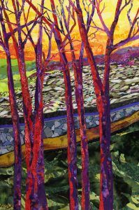
Subjective color is using your own color choices in creating an image. For example, if I painted a tree trunk purple or red, it would still be a tree, but the viewer might be disturbed by my use of those colors, instead of the local/real color. I didn’t learn about local and subjective colors while in college. If it was discussed, I might have been sick that day! After hearing about it in a workshop many years ago, I was not willing to consider that subjective colors might make my work more exciting and expressive. I mean, why would you do that?! (Side note: I am a slow learner sometimes.) One day, though, I did do a painting in subjective colors, and it turned out to be one of the more expressive and satisfying pieces I had done to that point. And though it seemed strange at first, I continued using subjective colors which helped make my work more expressive and more satisfying. Using subjective colors, I share my feelings about the topic, rather than replicate a photograph or scene. By choosing colors that I am attracted to, the colors themselves help describe my reaction to the subject.

Over the Edge
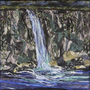
I just completed another painting. It is called Over the Edge. This is a fabric painting and I hope you will see how the rocks, cliffs, and stones are almost all subjective colors and patterns. I had drawn this scene many times during bible study, (sorry Robin) and I’ve also painted it in local colors using watercolor paint. This was fine but I wanted it to be more.
When I began the painting in fabric, I kept wavering between local and subjective colors, thinking: “Will it be too difficult to use subjective colors?” I mean, how could I paint rocks and cliffs, using pink prints, teal silk, and some strange knit fabric? It would look crazy!
Working with local colors is definitely a safe way to go. There would be less chance for a goof up. I really fought with myself with which way to go. Searching through browns, blacks, greys, I just wasn’t “feeling it.” I found plenty of interesting textures and shades in real colors, but I just wasn’t convinced. It all seemed so boring and mundane. I walked away from it for a day or two and then decided to look at some unusual colors and patterns. The first piece I chose was a fabulous silk from my niece’s clothing line. It is pink, and purple, with touches of teal, grey and brown. I had previously used this fabric in the painting “Integrated Neighborhood.”

Integrated Neighborhood
When I pinned it to the canvas on “Over the Edge” I knew immediately it was a go! It has such great movement, is very pliable, takes to glue well, and can be manipulated into sharp edges.
Then I searched for an odd piece of knit that I had also used in previous work called How I See It. In that painting, the pattern is laid horizontally, which made the fabric look like land or water. It has several colors in it. Pink, brown, black, grey, teal, and olive green. It is a very strange looking print, but it is so interestingly different!
I started to lay down the patterns and mixed them with some solids and netting. Hanging the multi-colored knit fabric vertically, I could stretch the design to look exaggerated and distorted. That made rock shapes appear! I was really enjoying this process.
The top of the painting needed to be recessed some, to give the illusion that the cliffs and waterfall were high and large. I found a caftan I bought at a garage sale and examined both sides of the fabric. Both sides would work! One side was used for the sky and the other side was used for trees. I was finally hitting my stride! Having the process go smoothly is always encouraging!
As you look at the painting, Integrated Neighborhoods, you can see the pink print fabric in the tree trunks. If you can enlarge the image and look at the patterns in detail, it will help in the explanation.
Then look at the painting, Over the Edge, and you see the same fabric in the cliffs. I find that amazing!
Same thing with the pattern in How I See It. The fabric behind the blue rock wall, sort of looks like hundreds of moving rocks, or water. It even makes you unsure if the painting is crooked, which I kind of like.

How I See It
Now look at the same fabric in Over the Edge, and see how different it looks as cliffs?
You might be saying, “Yes, but the water is real color!” You would be right, however, the use of patterns in the water, along with the netting, changes it all up. You know it is water, because of the color, but the patterns and textures make it subjective. I would say that Over the Edge is a subtle subjective painting. It is not as bold as How I See It, but it definitely is not Local colors!
Most new artists start out using realistic or local color. It’s easier and safer, especially when you’re trying to just learn the skill or technique. Adding in subjective colors can be a big step, and it takes time to develop one’s own style and preferences. Using subjective color is more risky, definitely more time consuming, and thoughtful; but oh what a way to go.
The way I paint today is much different than when I began, how many years ago. That is how it is supposed to happen. We learn, we grow, we learn, we grow…
I encourage you to look at artwork and decide what the artist used – local or subjective? And which do you like more? There is no absolute right or wrong here.
If you have questions or want to comment, please email me at:
[email protected].
Now Go Make Art!


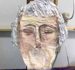
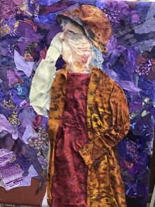 Well, the dress, coat, and hat went ok, but the proportions were off. The woman’s face is a side view, so I thought it would be somewhat easier. Although I had the face outlined I struggled to make the face look natural. At one point, she looked like she was in a wind tunnel and all her skin was being blown away from her bones. It was pretty funny! But then it wasn’t.